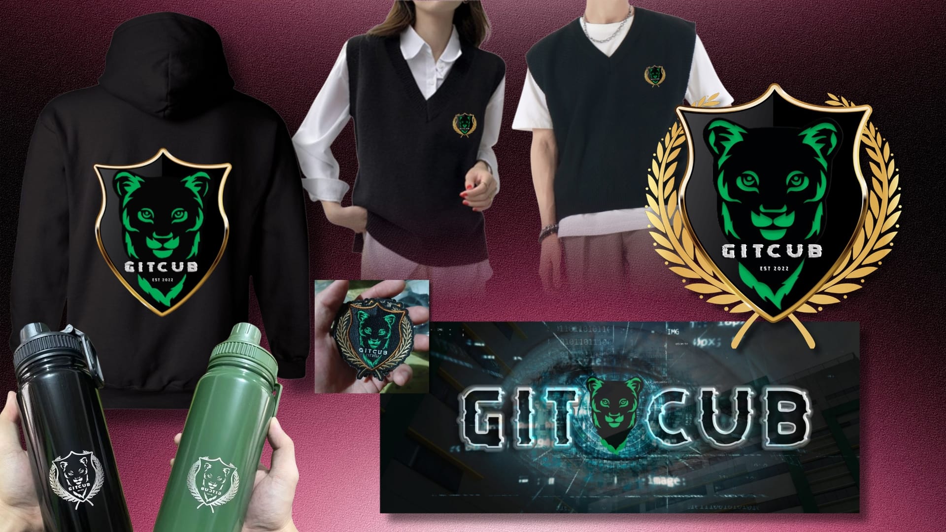
Quick Links Concept Exploration Symbolism of the Cub The Strategy The Solution Final Deliverables Long-Term Impact Categories Brand & IdentityCreative Design Tags Apparel DesignBrand IdentityBrand StrategyGraphic DesignLogo DesignMerchandise DesignStudent OrganizationVisual Identity Overview Project Title:Development of Brand Identity for a Student Organization – GitCub Project Type:Organization Project Role:Designer · Brand Strategist · Organization Secretary Responsibilities:Led the conceptualization, strategy development, visual identity creation, and implementation of the organization’s branding system in collaboration with organization officers and institutional stakeholders. Tools Used:Canva • Adobe Photoshop The Problem GitCub was a newly established student organization under the Institute of Computing and Digital Innovation (ICDI) of Kolehiyo ng Lungsod ng Dasmariñas. Founded during the institution’s pioneering years, the organization needed a complete visual identity from the ground up. The challenge was not simply to create a logo, but to establish a cohesive and recognizable brand identity that could represent the organization’s mission, values, and culture across both digital and physical platforms. At the time, the university itself was still undergoing rapid organizational and branding developments. Since the institution only started operating in 2021, several departments were continuously implementing adjustments, including changes to official branding guidelines and color systems. This created a moving target for the organization’s identity development. The most significant challenge centered around the logo design process. Months after the establishment of the organization’s logo and branding materials — particularly after the identity direction had already been approved and implemented — the university revised its official institutional color palette to align with the City of Dasmariñas branding system. As a result, the organization’s logo color palette had to be revised to comply with the updated institutional branding requirements, including the redesign and adjustment of previously developed branding materials that already incorporated the original logo system. This required a strategic redesign that preserved the organization’s established identity while adapting to newly mandated institutional branding requirements. The project therefore needed to solve several key problems: Create a distinctive identity for a newly formed organization with no existing visual foundation Balance professionalism with a student-centered and approachable image Ensure adaptability across uniforms, merchandise, publications, and digital platforms Differentiate the organization from visually similar campus organizations Align with evolving university branding requirements without losing brand recognition Build an identity that students would feel proud to wear and represent The Analysis Understanding the Organization GitCub was founded on October 11, 2022, by pioneering students who wanted to create a collaborative academic community focused on mentorship, growth, and peer support within the field of computing and digital innovation. The organization officially received institutional recognition on December 22, 2022. At its core, GitCub aimed to foster: Academic collaboration Leadership development Technical growth Student mentorship Community and belonging During discussions with founding officers and members, I gathered recurring themes that later became the foundation of the organization’s visual identity strategy. The recurring themes included: Strength Leadership Confidence Innovation Unity My objective was to translate these themes into an identity system that felt modern, memorable, and institutionally credible without appearing overly formal or intimidating to students. Concept Exploration Logo Shape Analysis – Why the Shield? After analyzing existing student organization identities, I strategically selected the shield shape because it communicated: Strength Leadership Protection of values Honor Identity Authority Distinction Unlike circular logos that often blend into institutional environments, the shield structure created strong silhouette recognition even before typography or color were processed. The shield became a symbolic statement: GitCub would not simply imitate existing organizations — it would establish its own identity. Symbol & Element Selection The logo system featured: A lion cub face A shield base structure Golden leaf framing Modern “Debug” typography for GitCub name Symbolic Meaning of the Elements Element Meaning Lion Cub Growth, curiosity, courage, emerging leadership Shield Protection, strength, honor, distinction Golden Leaves Achievement, growth, excellence Modern Typography Innovation, technology, contemporary identity Why the Lion Cub? One of the most important conceptual decisions I proposed during the project was the use of the lion cub as the organization’s central symbol. The “cub” in GitCub evolved beyond a simple wordplay reference and became a symbolic representation of the organization’s identity, aspirations, and growth journey. Symbolism of the Cub I developed the lion cub concept to represent: Emerging leadership Potential and growth Courage despite being young Curiosity and learning Future strength in development This symbolism closely mirrored the reality of the organization itself. GitCub was founded by pioneering students within a newly established university. Much like a cub still growing into its strength, the organization represented students who were still developing their technical skills, identities, and leadership capabilities. Rather than portraying dominance or authority through a fully mature lion, I intentionally chose the cub because it communicated something more relatable and authentic: growth in progress. This approach made the identity more approachable to students while still retaining symbolism associated with strength, bravery, confidence, and leadership. The cub also aligned with the organization’s mentorship-driven culture. It symbolized students learning together, supporting one another, and gradually growing into future professionals and leaders in technology. Color Palette Analysis The initial color palette of the GitCub identity system was developed with blue as the primary color, supported by black and dark gray for the shield structure, gray tones for the organization name in a modern “Debug”-style typography, and orange-gold accents for the leaf elements. The blue-based direction was chosen to communicate trust, loyalty, and reliability, while reinforcing a professional yet approachable identity. Combined with the shield and golden leaf elements, the overall system conveyed strength, prestige, and emerging leadership. Following institutional review and updated university branding guidelines, the primary color was revised from blue to green to align with the official school color system. This adjustment shifted the identity focus toward growth, harmony, and development while maintaining the original visual structure. The revised palette—green, black, gold, and gray—preserved the core symbolism of the design while ensuring compliance with institutional standards and maintaining brand consistency across all applications. Uniform Design Analysis During my observation of various student organizations within our university and other institutions, I