
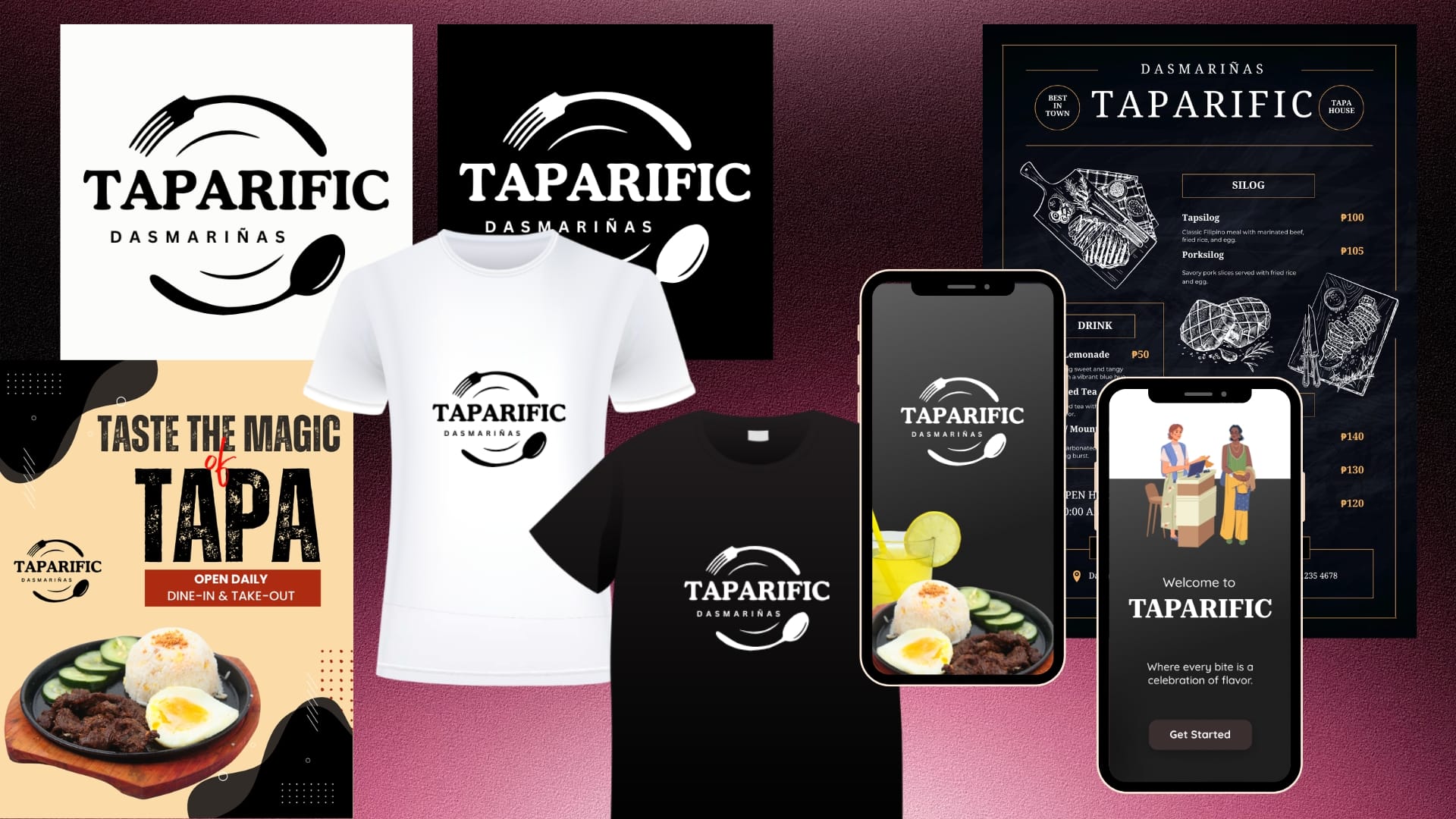
Quick Links Customer Journey Analysis The Strategy The Solution The Results Categories Brand & IdentityCreative DesignMobile Development Tags Brand IdentityBrand RevitalizationBranding StrategyLogo DesignPackaging DesignPop-up Store DioramaRestaurant BrandingUI/UX Design Project Title:Brand Identity Revitalization for Taparific Project Type:Academic Project Tools Used:Canva • Adobe Photoshop • Figma Role:Project Manager • Lead Designer Responsibilities: Led the overall brand revitalization project from research to final submission. Conducted a brand audit and customer journey analysis. Developed the brand strategy and customer experience framework. Redesigned the official Taparific Dasmariñas logo. Established the restaurant’s visual identity system. Designed the official packaging system and brand applications. Designed the mobile ordering application UI/UX prototype. Developed the pop-up store concept and presentation diorama. Designed marketing materials and branded merchandise concepts. Applied the visual identity consistently across physical and digital touchpoints. Coordinated project planning, design execution, and presentation of branding recommendations. The Problem While Taparific had established a loyal customer base, its visual identity and customer-facing materials lacked consistency, scalability, and strong brand recognition. The existing logo relied heavily on typography and did not immediately communicate the restaurant’s specialty or dining experience. The challenge was to create a cohesive brand ecosystem that would: • Strengthen brand recognition. • Improve customer experience across physical and digital touchpoints. • Support future marketing initiatives. • Remain practical and cost-efficient for a local food business operating within realistic budget constraints. The Analysis Before entering the design phase, I conducted an assessment to understand the business, customer touchpoints, and brand opportunities. Customer Perception Taparific’s core audience consists of: Students Office workers Families Food delivery customers These customers typically seek: Affordable meals Quick service Familiar Filipino flavors Convenient ordering experiences This insight suggested that the brand should feel: Approachable Familiar Authentic Modern Memorable Customer Journey Analysis I mapped the customer’s interaction journey across both physical and digital environments. The journey typically followed: Discovery → Product Exploration → Ordering → Payment → Fulfillment → Repeat Purchase Findings indicated opportunities to improve product discovery, simplify navigation, reduce decision-making friction, and strengthen brand recall through a more distinctive visual identity. Existing Brand Assessment Current Logo The original logo featured a decorative serif wordmark enclosed in a circular border. While simple and recognizable, it presented several limitations: Did not visually communicate food, dining, or the brand’s specialty products. Relied heavily on typography alone. Lacked distinctive visual elements that customers could immediately associate with the restaurant. Competitive Landscape Many local food businesses utilize visual elements that immediately communicate their food offerings. Brands that successfully combine recognizable food symbolism with strong typography often achieve better recall and stronger customer recognition. This highlighted an opportunity for Taparific to strengthen its identity by creating a stronger visual connection between the brand and its signature tapa meals. The Strategy The project was guided by three strategic objectives: Build a Consistent Brand Ecosystem.Create a unified visual language across packaging, menu boards, marketing materials, merchandise, and digital platforms. Improve Customer Decision-Making.Apply UI/UX and information architecture principles to simplify navigation, highlight key products, and reduce cognitive load. Design for Scalability and Cost Efficiency.Solutions were intentionally designed to be practical and budget-friendly. This aligns with Taparific’s strength in executing community-focused marketing campaigns that generate strong returns without requiring large capital investments. Packaging concepts prioritized low-cost production methods, limited-color printing, and scalable materials. Merchandise such as branded shirts was designed with affordability and bulk-production feasibility in mind. The overall strategy ensures that branding can be implemented realistically while maintaining professional quality. Visual Branding Strategy Instead of relying solely on typography, I introduced symbolic elements that directly connect to the dining experience. Food-Centric Identity The redesigned logo incorporates a fork and spoon, instantly communicating that Taparific is a food establishment. These elements frame the logo, creating a visual representation of a dining plate. Stronger Brand Recall Customers are more likely to remember visual symbols than text alone. By introducing recognizable dining utensils, the logo gains stronger visual recall and differentiation from competitors. Scalable Design System The new identity was designed to work consistently across: Packaging Menu boards Social media content Merchandise Store signage Mobile applications Customer Experience Strategy To ensure consistency beyond branding, the project also focused on improving customer interactions through: Digital Experience A mobile-friendly ordering experience was designed to streamline browsing, ordering, and payment processes. Physical Experience The pop-up store concept was developed to create a welcoming dining environment that visually reflects the brand identity. Marketing Consistency The same typography, colors, imagery, and branding principles were applied across all deliverables to strengthen recognition and trust. The Solution The final solution was a comprehensive branding and customer experience package designed specifically for Taparific Dasmariñas. Visual Identity System Logo Redesign The redesigned logo transformed the brand from a typography-focused identity into a more recognizable food-centric visual system. Key Improvements: Stronger visual recognition Improved readability Better scalability across print and digital media Enhanced local identity through the inclusion of “Dasmariñas” Menu Board Design A premium menu board system was developed using: Bold category hierarchy Gold accent colors Clean typography Strategic product placement Improved readability This helps customers quickly identify products and make purchasing decisions more efficiently. UI/UX Design A complete ordering application prototype was designed featuring: User-friendly navigation Product filtering Favorites functionality Order history Secure authentication Order tracking Checkout optimization The goal was to reduce customer effort and improve ordering convenience. Pop-Up Store Concept Sketch The diorama showcased how the brand could extend into a physical retail environment through: Consistent branding Organized customer flow Comfortable dining atmosphere Product-focused visual merchandising Brand Applications The new visual identity was applied across: Packaging Promotional materials Social media graphics Merchandise Store signage This ensured a cohesive and professional customer experience across every touchpoint. The Results Although developed as an academic-industry collaboration project, the outputs demonstrated how strategic branding can strengthen a local business’s market presence. Key Outcomes ✅ Developed a more distinctive and memorable visual identity. ✅ Created a cohesive branding system applicable across physical and digital platforms. ✅ Improved brand recognition through food-related visual symbolism. ✅ Enhanced customer experience through UI/UX design and environmental design