Quick Links
Categories
- Brand & IdentityCreative Design
Tags
- Brand IdentityBrand StrategyBrandingCreative DirectionGraphic DesignIdentity DesignLogo DesignLogo SymbolismMultimediaOrganizational BrandingStudent OrganizationVisual CommunicationVisual Identity
Overview
Project Title:
Development of the Brand Identity of a Multimedia Student Organization – NOVUS
Project Type:
Organization Project
Tools Used:
Canva • Adobe Photoshop
Role:
Designer · Brand Strategist · Organization Consultant
Responsibilities:
- Developed the organization’s name concept, the overall brand identity, including the logo concept, symbolism, and visual style.
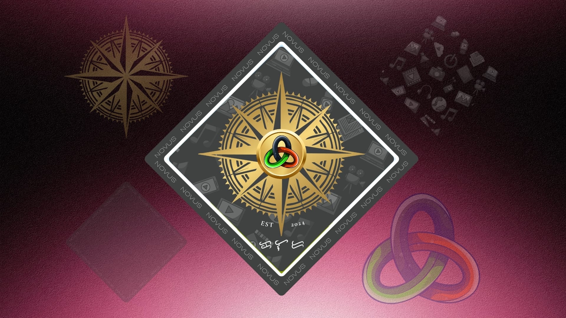
- Designed the official logo by integrating meaningful elements such as the compass, Trefoil Knot, and multimedia-inspired graphics.
- Defined the symbolism and rationale behind each visual element to ensure consistency in brand communication.
- Prepared branding assets for use across digital platforms, promotional materials, and organizational documents.
- Established a professional and cohesive visual identity that represents the multimedia student community and strengthens organizational recognition.
Background
Student organizations play an important role in developing students’ leadership, creativity, and professional skills outside the classroom. As a newly established multimedia student organization, NOVUS required a strong and meaningful brand identity that would represent its vision, values, and commitment to the multimedia community of Kolehiyo ng Lungsod ng Dasmariñas (KLD).
The goal was to create a visual identity that would inspire students, establish credibility, and communicate the organization’s purpose of nurturing future multimedia professionals.
The Challenge
The organization needed a brand identity that would:
- Represent the diverse disciplines within multimedia.
- Inspire creativity, innovation, and collaboration.
- Create a memorable and professional image for students and external partners.
- Reflect both technical expertise and artistic expression.
- Remain flexible for use across digital and printed media.
Research and Concept Development
The development process began by identifying words and concepts that best described the organization’s mission. The Latin word “novus” comes from Proto-Indo-European *new-, and later Proto-Indo-European *néwos (New.) meaning new, fresh, young, unusual, and extraordinary, was selected because it perfectly reflects the innovative nature of multimedia.
To further strengthen the identity, the name was expanded into the acronym:
NOVUS – Nurturing Outstanding Visions for Unprecedented Success
Each letter reinforces the organization’s mission:
- N – Nurturing: Emphasizes the supportive and developmental aspect of the organization, helping students grow their skills and talents.
- O – Outstanding: Highlights the aim for excellence and standing out in the field.
- V – Visions: Reflects the creative and visionary aspect of multimedia work.
- U – Unprecedented: Captures the uniqueness and innovation that the organization strives for.
- S – Success: Indicates the ultimate goal of achieving extraordinary results and accomplishments.
This slogan became the foundation of both the visual identity and the organization’s messaging.
Logo Development
The logo combines several symbolic elements that represent the organization’s mission and values.
Compass

The compass serves as the primary symbol of the logo. It represents guidance, direction, and leadership, emphasizing NOVUS’ commitment to helping students navigate their creative journeys.
Its golden color symbolizes:
- Excellence
- Achievement
- Trust
- Value
The detailed design also reflects precision, professionalism, and technical competence—qualities expected in the multimedia industry.
Multimedia Elements

The multimedia elements placed in the background of the compass represent the various facets of multimedia. Each of these icons is subtly placed in the background to emphasize that multimedia is a comprehensive field that encompasses various forms of digital and creative expression. Together, they represent the diversity and scope of the multimedia discipline, which the organization aims to foster and promote among its members and KLD community.
Chipset

The chipset symbolizes the technological foundation of multimedia, representing the computing systems and digital knowledge essential for creative media production. The repeated “NOVUS” text surrounding the chipset reinforces the organization’s identity, fostering unity, recognition, and a strong sense of belonging among its members. Together, these elements reflect the organization’s commitment to combining technology, creativity, and collaboration in developing future multimedia professionals.
Trefoil Knot


At the center of the compass is a Trefoil Knot, symbolizing:
- Unity
- Collaboration
- Interconnectedness
- Continuous growth
Its endless form represents lifelong learning and innovation, while its central placement highlights teamwork as the heart of the organization.
Each section of the knot carries a different color representing the organization’s core values:
- Dark Blue – Trust, stability, professionalism, and guidance
- Neon Green – Innovation, creativity, growth, and fresh ideas
- Fiery Red – Passion, confidence, determination, and achievement
Brand Identity Outcome

The completed brand identity successfully communicates NOVUS as a student organization that combines creativity, innovation, technical excellence, and collaboration.
The visual identity establishes a professional image while remaining youthful and dynamic. Every design element—from the compass and Trefoil Knot to the multimedia icons—works together to reinforce the organization’s mission of guiding multimedia students toward excellence.
Conclusion
The development of the NOVUS brand identity demonstrates how thoughtful visual design can communicate an organization’s purpose and values. By combining meaningful symbolism, carefully selected colors, and a strong organizational message, NOVUS establishes a recognizable identity that reflects its commitment to Nurturing Outstanding Visions for Unprecedented Success.
More than just a logo, the NOVUS brand identity serves as a symbol of guidance, creativity, collaboration, and continuous growth for every multimedia student it represents.