
Quick Links Objectives The Problem System Features Results Key Outcomes Skills Demonstrated Categories AutomationTech Projects Tags Appointment AutomationBusiness Process AutomationCRM AutomationCustomer Journey MappingEmail & SMS AutomationGoHighLevel (GHL)Lead NurturingMarketing AutomationPatient RetentionWorkflow Automation Overview Project Title:Automation System for Haneul Dental Care Project Type:Mock Project Tools Used:Miro • GoHighLevel Role:Marketing Automation Specialist Responsibilities: Designed and implemented end-to-end marketing automation workflows to streamline lead management and customer journeys. Built automated email and SMS campaigns for lead nurturing, follow-ups, re-engagement, and customer retention. Configured CRM pipelines, lead scoring, segmentation, tags, and custom fields for personalized marketing. Automated appointment scheduling, confirmations, reminders, and follow-up communications. The Haneul Dental Care Automation System is a marketing automation solution built using GoHighLevel (GHL). The project was designed to streamline patient communication, reduce administrative workload and increase patient retention through automated workflows that support the entire patient lifecycle. The system centralizes patient management by automating every major touchpoint—from the initial consultation booking to long-term recall reminders and online reputation management. By replacing repetitive manual tasks with automation, the clinic can provide a more consistent patient experience while allowing staff to focus on delivering quality dental care. Objectives The project aimed to: Automate the complete patient journey from consultation booking to long-term retention. Reduce appointment no-shows through timely email and SMS reminders. Recover missed consultations and treatment appointments using automated follow-up sequences. Increase treatment acceptance through personalized upsell campaigns. Improve patient retention with scheduled recall reminders. Enhance the clinic’s online reputation by automating review requests. Reduce administrative tasks through automated patient tracking and pipeline management. Provide a centralized CRM system for monitoring patient progress throughout every stage of care. The Problem Many small to medium-sized dental clinics still rely on manual processes to manage patient communication, appointment follow-ups, and retention efforts. As the number of patients grows, these repetitive administrative tasks consume valuable staff time, increase the likelihood of human error, and make it difficult to deliver a consistent patient experience. Without an automated communication system, clinics often encounter several operational challenges: Patients may forget their appointments, leading to increased no-show rates and lost revenue. Front desk staff spend significant time sending appointment confirmations, reminders, and follow-up messages manually. Missed consultations and treatment appointments are not consistently followed up, resulting in lost opportunities to recover potential patients. Treatment recommendations and upsell opportunities depend heavily on manual outreach, reducing treatment acceptance rates. Routine recall reminders are often overlooked, making it difficult to maintain long-term patient relationships and encourage preventive care. Requests for online reviews are inconsistent, limiting the clinic’s ability to strengthen its digital reputation. Patient information is scattered across different communication channels, making it challenging to track each patient’s progress throughout their journey. To address these challenges, this mock project demonstrates how an integrated marketing automation system built with GoHighLevel (GHL) can centralize patient management, automate repetitive communication, and support the complete patient lifecycle—from the initial consultation to long-term retention and re-engagement. System Features The Haneul Dental Care Automation System includes the following core workflows: Patient Consultation Booking Once a patient confirms their appointment, the system takes over so the team doesn’t have to manually follow up. Here’s what happens behind the scenes: 1. Appointment Confirmed As soon as the patient books or confirms their consultation, they’re automatically marked as having an upcoming appointment. This keeps the records organized and lets the team instantly see where each patient is in the booking process. 2. Instant Confirmation The patient immediately receives: A confirmation SMS A confirmation Email This reassures them that their booking has been successfully secured and provides all the appointment details. 3. Checking for Reschedules The system waits until the day before the appointment. If the patient has already rescheduled before this point, the automation recognizes that and adjusts accordingly. This prevents unnecessary reminder messages from being sent for an old appointment. 4. 24-Hour Reminder If the appointment hasn’t changed, the patient receives a friendly reminder 24 hours before their visit. This helps reduce forgotten appointments and improves attendance. 5. Final Check Before the Appointment Two hours before the scheduled appointment, the system checks one last time to see if the patient has rescheduled. 6. 2-Hour Reminder If the appointment is still active, the patient receives a short SMS reminder letting them know their appointment is coming up soon. This serves as a final nudge and helps minimize no-shows. Consultation No-Show Recovery When a patient misses their appointment, the system automatically begins a gentle follow-up process to encourage them to book another consultation—without requiring staff to manually contact every patient. Step 1: Patient Misses Their Appointment If a patient doesn’t attend their scheduled consultation, the system automatically updates their status and starts a recovery sequence. This helps ensure that no potential patient is forgotten. Step 2: First Follow-Up (Immediately) The patient receives a friendly SMS acknowledging that they missed their appointment and inviting them to reschedule if they’re still interested. This gives them an easy opportunity to book again. Step 3: Wait and Check The system waits for about an hour to see whether the patient has already rebooked. If they have rebooked: the recovery messages stop immediately. Their record is updated to show they have a new appointment. This prevents patients from receiving unnecessary reminders after they’ve already booked. Step 4: Second Follow-Up (Next Day) If the patient still hasn’t booked, they receive a follow-up email the next day. Instead of simply reminding them, this email reinforces the benefits of the consultation and encourages them to secure another appointment. Step 5: Check Again After another waiting period, the system checks once more if they’ve rebooked. If yes, the recovery campaign ends. If not, it continues with another reminder. Step 6: Third Follow-Up The patient receives another SMS a few days later. This serves as a final friendly reminder for patients who may have simply forgotten or become busy. Step 7: Final Opportunity After waiting a few more days, the system performs one final check. If the patient has booked, their status is updated and they exit the recovery
Development of Brand Identity for an Alumni Organization – KLDAA
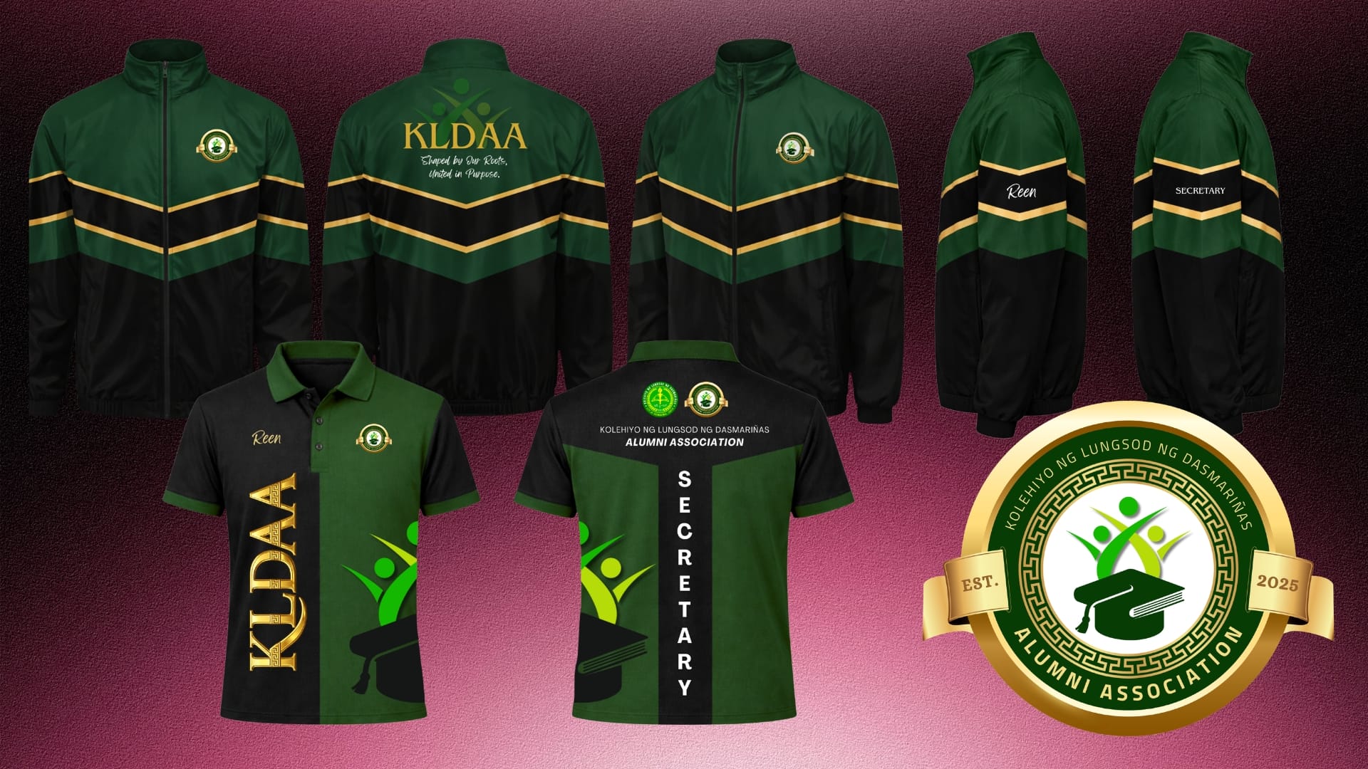
Quick Links The Problem Concept Exploration The Strategy The Solution The Results Categories Brand & IdentityCreative Design Tags Alumni AssociationBrand IdentityBrand StrategyGraphic DesignLogo DesignOrganizational BrandingRebrandingVisual Identity Overview Project Title:Development of Brand Identity for an Alumni Organization – KLDAA Project Type:Organization Project Tools Used:Canva • Adobe Photoshop Role:Designer · Brand Strategist · Organization Secretary Responsibilities: Led the revision and finalization of the Constitution and By-Laws (CBL) Developed the organization’s brand strategy and positioning Created and presented the official branding proposal Designed the official KLDAA logo Defined the brand mission, vision, values, and messaging framework Established the organization’s visual identity system Designed official uniform layouts (Polo Shirt and Jacket) Designed the official Facebook Cover Established and launched the official KLDAA Facebook Page Presented branding recommendations to the Executive Board The Problem The Kolehiyo ng Lungsod ng Dasmariñas Alumni Association was operating under its second term of leadership after the first administration, elected in September 2023, became largely inactive. Although the previous officers had produced an initial Constitution and By-Laws (CBL) document and a logo concept, several organizational gaps remained: The Constitution and By-Laws required significant revisions and updates. The original logo existed only as an image embedded within the CBL document. No editable, JPG, PNG, or official source files were turned over to the new administration. The association lacked a defined brand identity, visual standards, and communication framework. There was no established social media presence or unified visual representation for alumni engagement. As the elected Secretary of KLDAA, I recognized the need to establish a professional and sustainable brand identity that would strengthen organizational credibility, alumni engagement, and institutional recognition. The Analysis The project began with the revision of the organization’s Constitution and By-Laws (CBL), which provided an opportunity to understand the association beyond its administrative structure and uncover the values that should define its identity. Through discussions with the Executive Board and a review of the Association’s objectives, I identified a recurring challenge: while the organization had a governing document and a logo concept, it lacked a clear brand foundation that members could rally behind. I analyzed the Association’s purpose, goals, and future aspirations to determine what the brand should represent. Key Brand Insights Alumni Connection The Association exists to maintain a lifelong relationship between graduates and the University. The brand needed to reinforce the idea that alumni remain connected regardless of profession, generation, or location. Growth and Lifelong Learning The University’s mission extends beyond graduation. The brand needed to reflect continuous personal and professional development. Institutional Pride As the official alumni association, the visual identity needed to embody credibility, professionalism, and a strong connection to Kolehiyo ng Lungsod ng Dasmariñas. From these findings, I established five brand pillars that would guide both the messaging and visual identity: Knowledge Leadership Unity Service Growth Concept Exploration With the brand pillars defined, I explored visual elements that could translate the Association’s purpose into a meaningful and timeless identity. Circular Seal I selected a circular structure to symbolize continuity, belonging, and the lifelong bond among alumni. The shape reinforces the idea that graduates remain part of a single community regardless of where life takes them. Greek Key (Meander) Pattern The Greek key pattern was introduced to represent knowledge, wisdom, and perseverance. Its continuous form reflects lifelong learning and the enduring pursuit of excellence. Human Figures in Motion The three abstract figures represent the relationship among Alumni, Students, and the KLD Community. Their upward movement symbolizes leadership, collaboration, progress, and collective achievement. Book and Graduation Cap The combination of the book and graduation cap was explored as a central academic symbol representing knowledge transformed into achievement. It reinforces the University’s role in shaping future leaders and professionals. Color Strategy Analysis Color selection was approached strategically to reflect both institutional heritage and future growth. Dark Green Chosen to communicate integrity, commitment, reliability, and institutional pride. Gold Gradient Selected to represent achievement, honor, legacy, and the value of education. Growth Green Spectrum Introduced to symbolize progress, leadership, innovation, and the evolving role of alumni within society. These elements collectively formed a visual system capable of representing the Association’s mission while remaining adaptable for future initiatives and applications. The Strategy Rather than creating only a logo, my objective was to build a complete brand foundation that would provide long-term direction for the Association. The strategy focused on transforming KLDAA from an organization with limited visual assets into a recognizable alumni community with a clear identity, voice, and purpose. Defining the Brand Narrative I developed a brand narrative centered on the idea that alumni are shaped by their academic roots but united through a shared responsibility to contribute to the University’s growth and the success of future generations. This narrative became the basis for all messaging and visual decisions. Establishing Brand Positioning I positioned KLDAA as more than an alumni network. The Association would be represented as a community of leaders, professionals, and advocates who remain actively connected to their alma mater through service, collaboration, and mentorship. This positioning helped differentiate the organization from traditional alumni groups that focus solely on reunions and networking. Creating a Consistent Messaging Framework To ensure consistency across future communications, I developed: Brand Tagline Mission Statement Vision Statement Core Values Framework Brand Statement These components established a unified voice that could be used across official documents, events, social media platforms, and future campaigns. Building a Memorable Values System To improve internal alignment and member engagement, I developed the A.L.U.M.N.I. Core Values Framework: Accountability Leadership Unity Meaningful Service Nurturing Growth Integrity This transformed the Association’s values into a memorable identity that members could easily understand and embody. Designing for Scalability The visual identity was intentionally designed to function across multiple touchpoints, including: Official documents Social media platforms Organizational uniforms Event materials Future marketing campaigns Alumni engagement initiatives This ensured the brand could grow alongside the organization while maintaining consistency and recognition. The result was a branding strategy that aligned governance, communication, and visual identity into a single cohesive system that supports the Association’s long-term
Supply Chain Management System
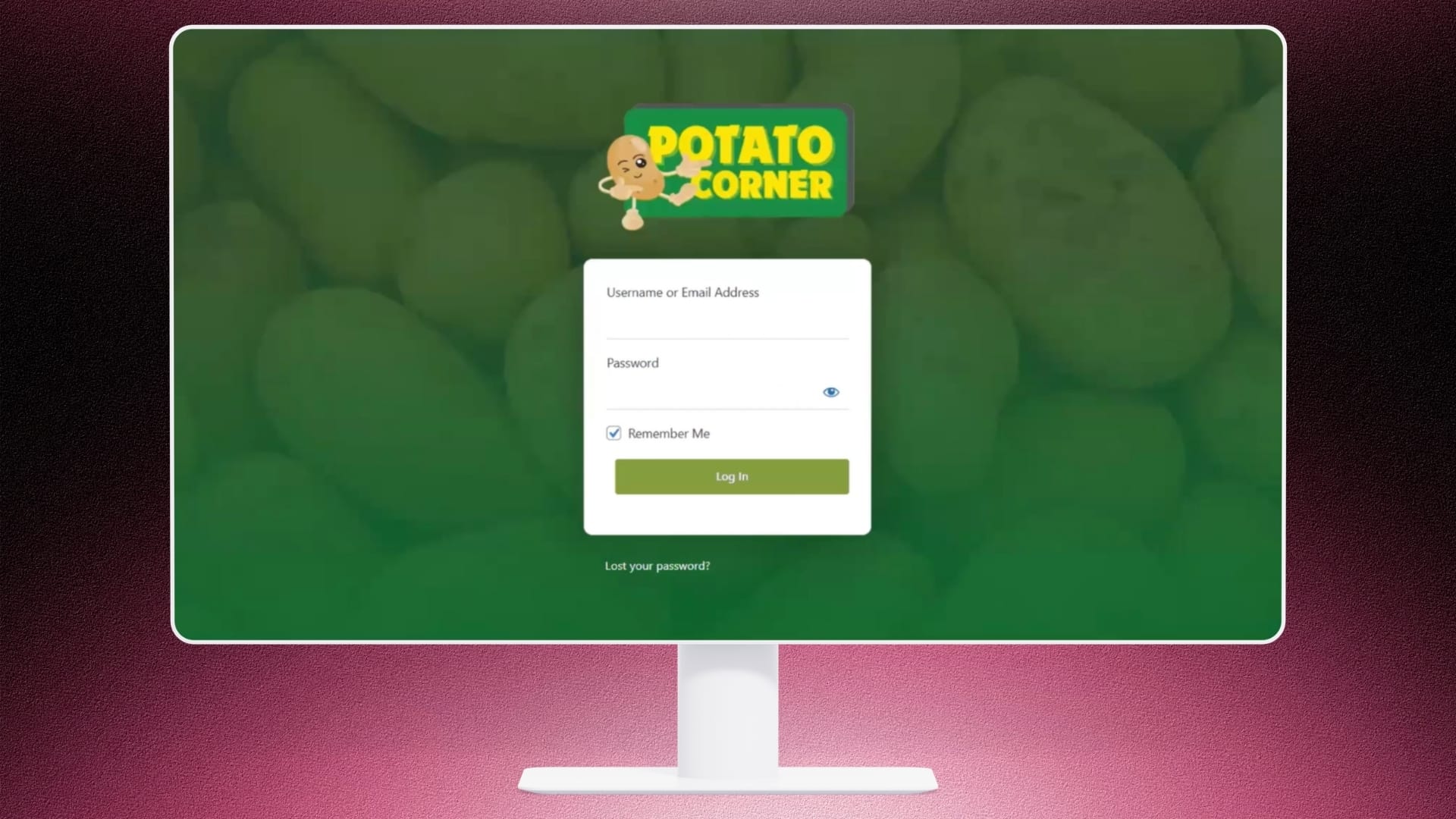
Quick Links Video Demo Categories Tech ProjectsWeb Development Tags CMS DevelopmentE-commerce SolutionElementorInventory ManagementProcess AutomationSupply ChainWooCommerceWordPress Project Title: Supply Chain Management (SCM) System Project Type: Academic Project – Web Application Role: Project Manager • Business & System Analyst • Web Designer Tools Used: WordPress, Elementor, ATUM Inventory Management Tool (WordPress Plugin) Executive Summary The Supply Chain Management System is a web-based application developed using WordPress and the ATUM Inventory Management Tool plugin, with Potato Corner serving as the sample client to simulate real-world supply chain operations. As part of the integrated Supply Chain Management project, the system is designed to support the procurement and inventory management processes involved in sourcing raw materials and maintaining inventory for a food service business. The application enables procurement personnel to create and manage Purchase Orders (POs), maintain supplier records, monitor inbound stock, perform inventory audits through stock takes, and oversee warehouse operations such as pick-and-pack processes. It also provides centralized inventory management, manufacturing support, inventory logs, dashboards with graphical reports, and WooCommerce integration for managing products, customer orders, and reports. The procurement workflow follows a structured Purchase Order lifecycle, where the procurement department creates Purchase Orders, sends them to suppliers, tracks deliveries, performs quality checks upon receipt, updates inventory levels, and completes the procurement process. By implementing these features, the system enhances inventory visibility, improves procurement efficiency, ensures accurate stock management, and provides a practical educational platform for demonstrating real-world supply chain management processes within the context of Potato Corner’s business operations. Video Demonstration https://youtu.be/dFHpAwS8odM
Brand Identity Revitalization for Taparific
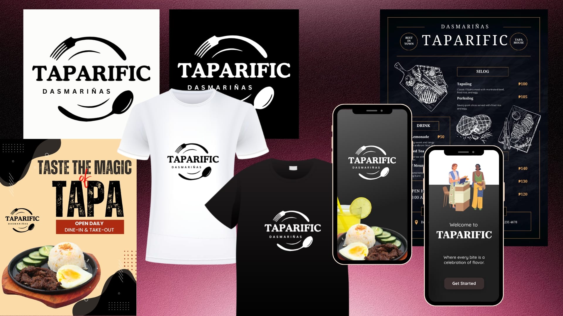
Quick Links Customer Journey Analysis The Strategy The Solution The Results Categories Brand & IdentityCreative DesignMobile Development Tags Brand IdentityBrand RevitalizationBranding StrategyLogo DesignPackaging DesignPop-up Store DioramaRestaurant BrandingUI/UX Design Project Title:Brand Identity Revitalization for Taparific Project Type:Academic Project Tools Used:Canva • Adobe Photoshop • Figma Role:Project Manager • Lead Designer Responsibilities: Led the overall brand revitalization project from research to final submission. Conducted a brand audit and customer journey analysis. Developed the brand strategy and customer experience framework. Redesigned the official Taparific Dasmariñas logo. Established the restaurant’s visual identity system. Designed the official packaging system and brand applications. Designed the mobile ordering application UI/UX prototype. Developed the pop-up store concept and presentation diorama. Designed marketing materials and branded merchandise concepts. Applied the visual identity consistently across physical and digital touchpoints. Coordinated project planning, design execution, and presentation of branding recommendations. The Problem While Taparific had established a loyal customer base, its visual identity and customer-facing materials lacked consistency, scalability, and strong brand recognition. The existing logo relied heavily on typography and did not immediately communicate the restaurant’s specialty or dining experience. The challenge was to create a cohesive brand ecosystem that would: • Strengthen brand recognition. • Improve customer experience across physical and digital touchpoints. • Support future marketing initiatives. • Remain practical and cost-efficient for a local food business operating within realistic budget constraints. The Analysis Before entering the design phase, I conducted an assessment to understand the business, customer touchpoints, and brand opportunities. Customer Perception Taparific’s core audience consists of: Students Office workers Families Food delivery customers These customers typically seek: Affordable meals Quick service Familiar Filipino flavors Convenient ordering experiences This insight suggested that the brand should feel: Approachable Familiar Authentic Modern Memorable Customer Journey Analysis I mapped the customer’s interaction journey across both physical and digital environments. The journey typically followed: Discovery → Product Exploration → Ordering → Payment → Fulfillment → Repeat Purchase Findings indicated opportunities to improve product discovery, simplify navigation, reduce decision-making friction, and strengthen brand recall through a more distinctive visual identity. Existing Brand Assessment Current Logo The original logo featured a decorative serif wordmark enclosed in a circular border. While simple and recognizable, it presented several limitations: Did not visually communicate food, dining, or the brand’s specialty products. Relied heavily on typography alone. Lacked distinctive visual elements that customers could immediately associate with the restaurant. Competitive Landscape Many local food businesses utilize visual elements that immediately communicate their food offerings. Brands that successfully combine recognizable food symbolism with strong typography often achieve better recall and stronger customer recognition. This highlighted an opportunity for Taparific to strengthen its identity by creating a stronger visual connection between the brand and its signature tapa meals. The Strategy The project was guided by three strategic objectives: Build a Consistent Brand Ecosystem.Create a unified visual language across packaging, menu boards, marketing materials, merchandise, and digital platforms. Improve Customer Decision-Making.Apply UI/UX and information architecture principles to simplify navigation, highlight key products, and reduce cognitive load. Design for Scalability and Cost Efficiency.Solutions were intentionally designed to be practical and budget-friendly. This aligns with Taparific’s strength in executing community-focused marketing campaigns that generate strong returns without requiring large capital investments. Packaging concepts prioritized low-cost production methods, limited-color printing, and scalable materials. Merchandise such as branded shirts was designed with affordability and bulk-production feasibility in mind. The overall strategy ensures that branding can be implemented realistically while maintaining professional quality. Visual Branding Strategy Instead of relying solely on typography, I introduced symbolic elements that directly connect to the dining experience. Food-Centric Identity The redesigned logo incorporates a fork and spoon, instantly communicating that Taparific is a food establishment. These elements frame the logo, creating a visual representation of a dining plate. Stronger Brand Recall Customers are more likely to remember visual symbols than text alone. By introducing recognizable dining utensils, the logo gains stronger visual recall and differentiation from competitors. Scalable Design System The new identity was designed to work consistently across: Packaging Menu boards Social media content Merchandise Store signage Mobile applications Customer Experience Strategy To ensure consistency beyond branding, the project also focused on improving customer interactions through: Digital Experience A mobile-friendly ordering experience was designed to streamline browsing, ordering, and payment processes. Physical Experience The pop-up store concept was developed to create a welcoming dining environment that visually reflects the brand identity. Marketing Consistency The same typography, colors, imagery, and branding principles were applied across all deliverables to strengthen recognition and trust. The Solution The final solution was a comprehensive branding and customer experience package designed specifically for Taparific Dasmariñas. Visual Identity System Logo Redesign The redesigned logo transformed the brand from a typography-focused identity into a more recognizable food-centric visual system. Key Improvements: Stronger visual recognition Improved readability Better scalability across print and digital media Enhanced local identity through the inclusion of “Dasmariñas” Menu Board Design A premium menu board system was developed using: Bold category hierarchy Gold accent colors Clean typography Strategic product placement Improved readability This helps customers quickly identify products and make purchasing decisions more efficiently. UI/UX Design A complete ordering application prototype was designed featuring: User-friendly navigation Product filtering Favorites functionality Order history Secure authentication Order tracking Checkout optimization The goal was to reduce customer effort and improve ordering convenience. Pop-Up Store Concept Sketch The diorama showcased how the brand could extend into a physical retail environment through: Consistent branding Organized customer flow Comfortable dining atmosphere Product-focused visual merchandising Brand Applications The new visual identity was applied across: Packaging Promotional materials Social media graphics Merchandise Store signage This ensured a cohesive and professional customer experience across every touchpoint. The Results Although developed as an academic-industry collaboration project, the outputs demonstrated how strategic branding can strengthen a local business’s market presence. Key Outcomes ✅ Developed a more distinctive and memorable visual identity. ✅ Created a cohesive branding system applicable across physical and digital platforms. ✅ Improved brand recognition through food-related visual symbolism. ✅ Enhanced customer experience through UI/UX design and environmental design
Animal Adoption Management System
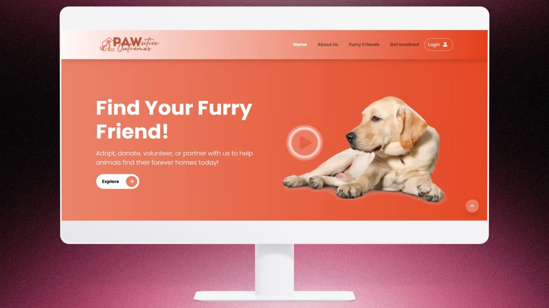
Quick Links Video Demo Technical Improvements Categories Tech ProjectsWeb DevelopmentWebsite Tags Animal AdoptionBootstrapCRUD ApplicationCSSDatabase DesignFull-Stack DevelopmentHTMLJavaScriptManagement SystemMySQLPHP Project Title: Animal Adoption Management System – Redesign & System Enhancement Project Type: Client Project – Web Application Role: UI/UX Designer • Full Stack Developer • Database Administrator Tools Used: PHP, HTML, CSS, JavaScript, MySQL, Bootstrap, AdminLTE, Figma Executive Summary The Animal Adoption Management System was developed for an animal welfare organization responsible for managing multiple partner shelters. Although the original system implemented essential features such as user authentication, animal listings, and adoption request processing, it faced significant usability, functionality, and administrative limitations that prevented it from fully meeting the organization’s operational requirements. To address these challenges, the client requested a comprehensive redesign and enhancement of both the public-facing website and the administrative system. The primary objectives were to improve user experience, streamline operational workflows, enhance system reliability, and establish a scalable architecture capable of supporting future growth. The redevelopment focused on modernizing the user interface, resolving critical functional issues, implementing missing modules, optimizing existing processes, and introducing a structured multi-user access system with role-based permissions. The completed system provides a modern, intuitive, and efficient platform that significantly improves animal record management, adoption processing, volunteer coordination, donation tracking, and administrative reporting, enabling the organization to manage its operations more effectively across multiple shelters. Video Demonstration A comparison of the original system and the redesigned system I worked on. Original System Provided by the client This is the original system before the redesign and enhancements. https://youtu.be/nRz_nNJlIbo Redesigned System I redesigned the interface, improved functionality, developed missing modules, optimized workflows, and implemented a multi-user system. Website Navigation User Access Admin Access https://youtu.be/4biIB8CW2J8 Technical Improvements Broken Authentication No User and Super Admin Login Upload Errors Poor UI Limited Reports Manual Processes Missing Functionalities Complete Role-Based Access Control Multi-role System Stable Image Upload Modern Responsive Design Dashboard Analytics Automated Workflow Functional & Operational Features The redesigned Animal Adoption Management System transformed a partially functional project into a comprehensive, production-ready platform capable of supporting multi-shelter animal adoption operations. By addressing critical usability issues, implementing role-based administration, improving system reliability, and enhancing overall user experience, the platform now provides a scalable solution that benefits adopters, shelter administrators, volunteers, donors, and organizational managers alike. Throughout this project, I gained practical experience in redesigning and enhancing an existing software solution while balancing user needs, technical constraints, and business objectives. I focused on improving usability, optimizing workflows, resolving system defects, and implementing a scalable architecture to enhance the system’s overall performance and maintainability. This experience strengthened my skills in systems analysis, full-stack development, UI/UX design, debugging, and effective client communication, while reinforcing the importance of delivering solutions that align with both organizational goals and user expectations.
Development of the Brand Identity of a Multimedia Student Organization – NOVUS
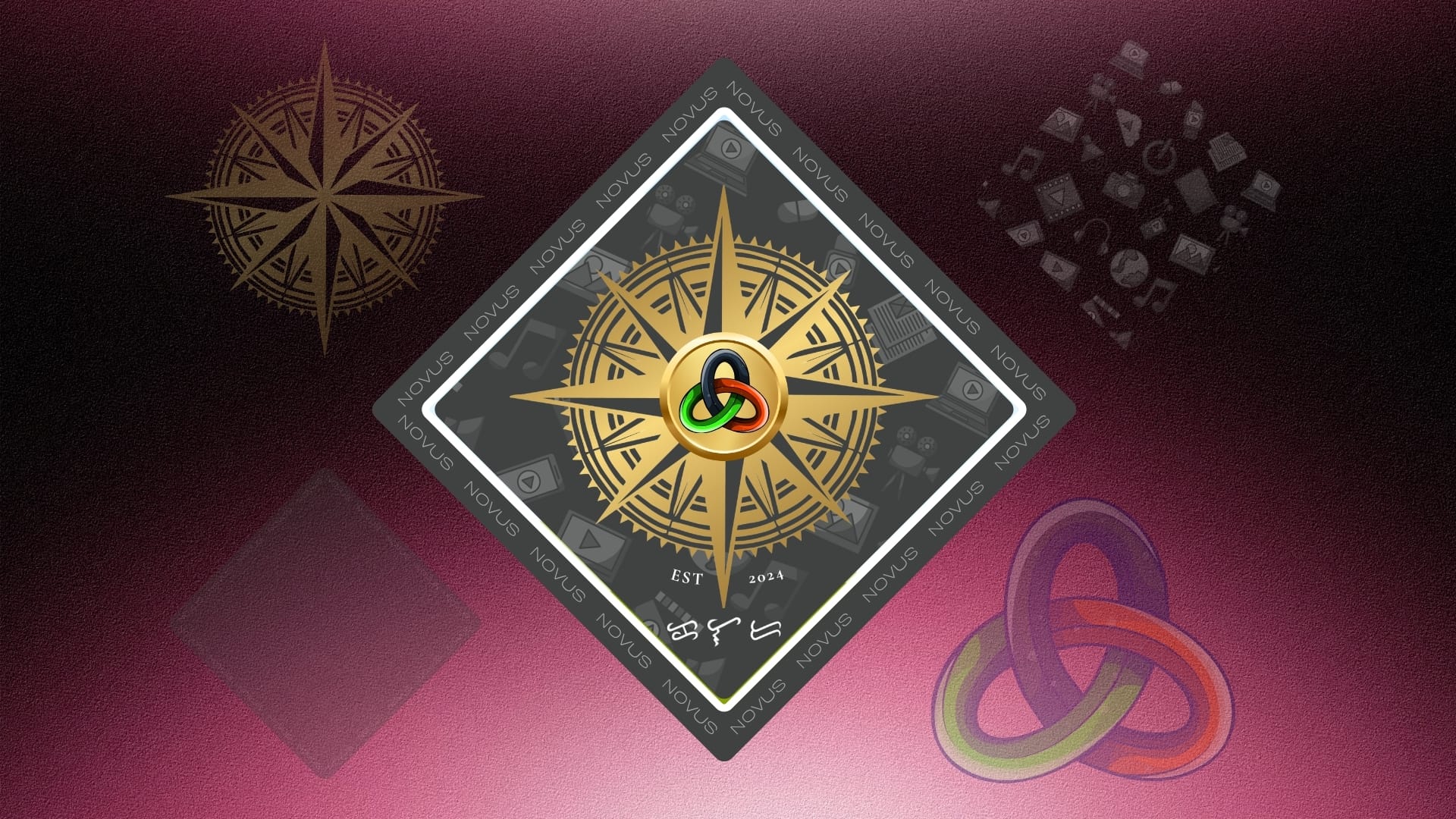
Quick Links Research & Concept Development Logo Development Brand Identity Outcome Categories Brand & IdentityCreative Design Tags Brand IdentityBrand StrategyBrandingCreative DirectionGraphic DesignIdentity DesignLogo DesignLogo SymbolismMultimediaOrganizational BrandingStudent OrganizationVisual CommunicationVisual Identity Overview Project Title:Development of the Brand Identity of a Multimedia Student Organization – NOVUS Project Type:Organization Project Tools Used:Canva • Adobe Photoshop Role:Designer · Brand Strategist · Organization Consultant Responsibilities: Developed the organization’s name concept, the overall brand identity, including the logo concept, symbolism, and visual style. Designed the official logo by integrating meaningful elements such as the compass, Trefoil Knot, and multimedia-inspired graphics. Defined the symbolism and rationale behind each visual element to ensure consistency in brand communication. Prepared branding assets for use across digital platforms, promotional materials, and organizational documents. Established a professional and cohesive visual identity that represents the multimedia student community and strengthens organizational recognition. Background Student organizations play an important role in developing students’ leadership, creativity, and professional skills outside the classroom. As a newly established multimedia student organization, NOVUS required a strong and meaningful brand identity that would represent its vision, values, and commitment to the multimedia community of Kolehiyo ng Lungsod ng Dasmariñas (KLD). The goal was to create a visual identity that would inspire students, establish credibility, and communicate the organization’s purpose of nurturing future multimedia professionals. The Challenge The organization needed a brand identity that would: Represent the diverse disciplines within multimedia. Inspire creativity, innovation, and collaboration. Create a memorable and professional image for students and external partners. Reflect both technical expertise and artistic expression. Remain flexible for use across digital and printed media. Research and Concept Development The development process began by identifying words and concepts that best described the organization’s mission. The Latin word “novus” comes from Proto-Indo-European *new-, and later Proto-Indo-European *néwos (New.) meaning new, fresh, young, unusual, and extraordinary, was selected because it perfectly reflects the innovative nature of multimedia. To further strengthen the identity, the name was expanded into the acronym: NOVUS – Nurturing Outstanding Visions for Unprecedented Success Each letter reinforces the organization’s mission: N – Nurturing: Emphasizes the supportive and developmental aspect of the organization, helping students grow their skills and talents. O – Outstanding: Highlights the aim for excellence and standing out in the field. V – Visions: Reflects the creative and visionary aspect of multimedia work. U – Unprecedented: Captures the uniqueness and innovation that the organization strives for. S – Success: Indicates the ultimate goal of achieving extraordinary results and accomplishments. This slogan became the foundation of both the visual identity and the organization’s messaging. Logo Development The logo combines several symbolic elements that represent the organization’s mission and values. Compass The compass serves as the primary symbol of the logo. It represents guidance, direction, and leadership, emphasizing NOVUS’ commitment to helping students navigate their creative journeys. Its golden color symbolizes: Excellence Achievement Trust Value The detailed design also reflects precision, professionalism, and technical competence—qualities expected in the multimedia industry. Multimedia Elements The multimedia elements placed in the background of the compass represent the various facets of multimedia. Each of these icons is subtly placed in the background to emphasize that multimedia is a comprehensive field that encompasses various forms of digital and creative expression. Together, they represent the diversity and scope of the multimedia discipline, which the organization aims to foster and promote among its members and KLD community. Chipset The chipset symbolizes the technological foundation of multimedia, representing the computing systems and digital knowledge essential for creative media production. The repeated “NOVUS” text surrounding the chipset reinforces the organization’s identity, fostering unity, recognition, and a strong sense of belonging among its members. Together, these elements reflect the organization’s commitment to combining technology, creativity, and collaboration in developing future multimedia professionals. Trefoil Knot At the center of the compass is a Trefoil Knot, symbolizing: Unity Collaboration Interconnectedness Continuous growth Its endless form represents lifelong learning and innovation, while its central placement highlights teamwork as the heart of the organization. Each section of the knot carries a different color representing the organization’s core values: Dark Blue – Trust, stability, professionalism, and guidance Neon Green – Innovation, creativity, growth, and fresh ideas Fiery Red – Passion, confidence, determination, and achievement Brand Identity Outcome The completed brand identity successfully communicates NOVUS as a student organization that combines creativity, innovation, technical excellence, and collaboration. The visual identity establishes a professional image while remaining youthful and dynamic. Every design element—from the compass and Trefoil Knot to the multimedia icons—works together to reinforce the organization’s mission of guiding multimedia students toward excellence. Conclusion The development of the NOVUS brand identity demonstrates how thoughtful visual design can communicate an organization’s purpose and values. By combining meaningful symbolism, carefully selected colors, and a strong organizational message, NOVUS establishes a recognizable identity that reflects its commitment to Nurturing Outstanding Visions for Unprecedented Success. More than just a logo, the NOVUS brand identity serves as a symbol of guidance, creativity, collaboration, and continuous growth for every multimedia student it represents.
IoT-Based Fire Alarm System
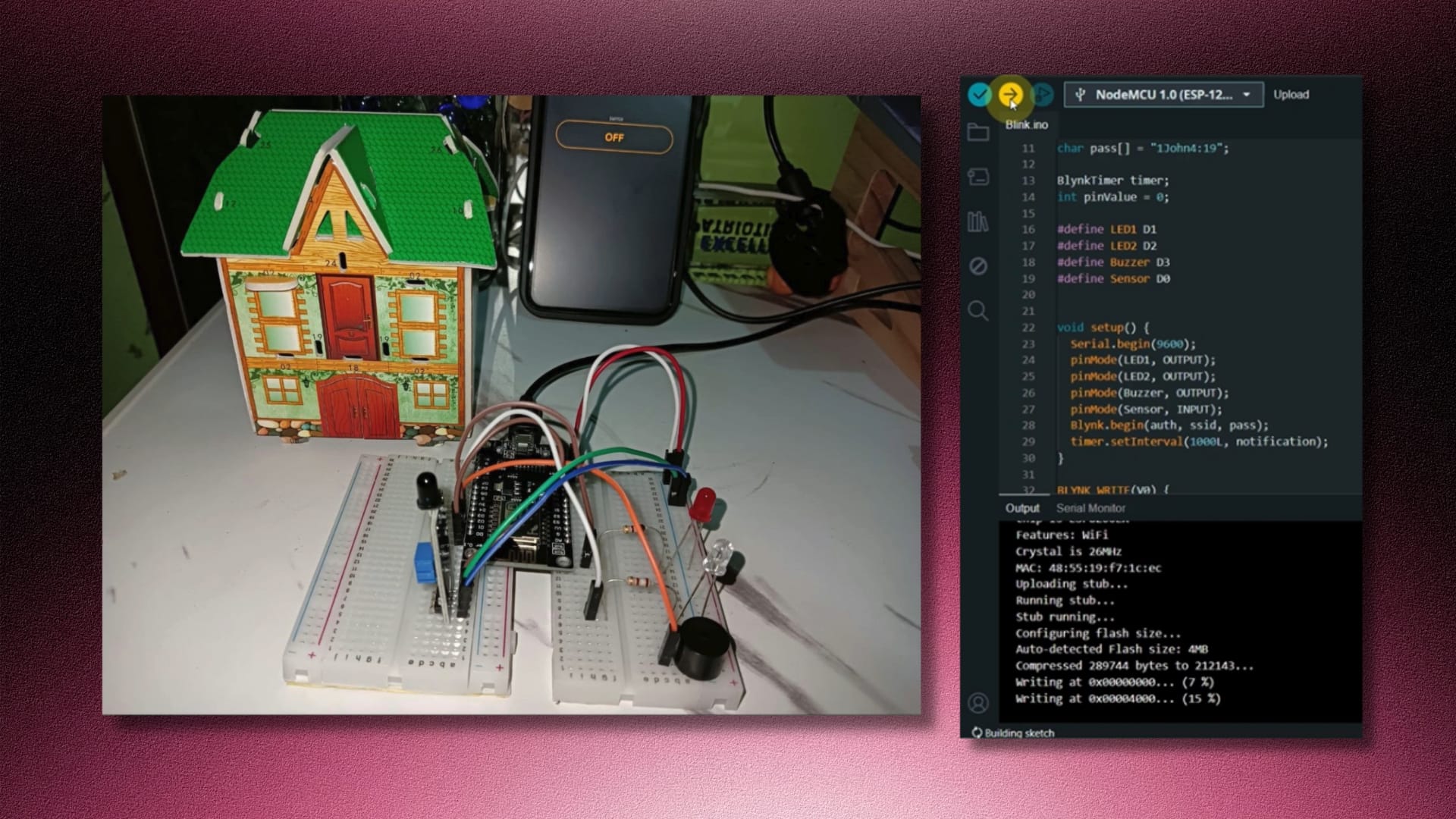
Quick Links Video Demo Features Functions Required Components Schematic Diagram Circuit Diagram User Guide Categories Internet of ThingsTech Projects Tags Arduino ProgrammingBlynkESP8266Fire Alarm SystemHardware ProjectInternet of ThingsIoTNodeMCUSensors Project Title: IoT-Based Fire Alarm System Project Type: Academic Project – Internet of Things Role: Project Manager • Developer Tools Used: NodeMCU ESP8266 microcontroller, Flame sensor, LED, Buzzer, 180-ohm Resistors, Breadboard, Jumper Wires, WIFI Library, Blynk Library Objectives To develop a reliable fire detection system using NodeMCU ESP8266; To integrate the fire alarm system with the Blynk platform for remote monitoring and control; To provide real-time notifications to users via the Blynk app in case of fire detection; and To ensure ease of installation and configuration for end-users. Features IoT Technology – The system utilizes Internet of Things technology, allowing for remote monitoring and control of the fire alarm system. Flame Sensor – Incorporates a flame sensor module to detect the presence of fire or abnormal heat levels. Push Notification – Sends push notifications to the user’s smartphone via the Blynk app in case of a fire event, ensuring immediate awareness and response. Blynk Integration – Integrates with the Blynk platform, enabling remote access to the fire alarm system from anywhere with an internet connection. Suitable for Various Settings – Designed for use in homes, offices, and factories. Functions Fire Detection – Monitors the environment for signs of fire using the flame sensor module, triggering an alarm when detected. Push Notification Alert – Sends real-time push notifications to the user’s smartphone through the Blynk app upon detecting a fire, to ensure prompt action can be taken. Remote Monitoring and Control – Allows users to remotely monitor the status of the fire alarm system and control its functions through the Blynk app. Safety Assurance – Enhances safety measures by providing timely alerts in the event of a fire, helping to minimize potential damages and ensure the safety of occupants in the connected location. Easy Installation and Operation – Offers a user-friendly interface and straightforward setup process, making it accessible to users with varying levels of technical expertise. Required Components NodeMCU board (ESP8266) Flame sensor LED 180-ohm resistors Buzzer Breadboard Jumper wires WIFI library Blynk library Schematic Diagram Circuit Diagram Video Demonstration https://youtu.be/Q0gIdRI_51c User Guide Introduction: The IoT Based Fire Alarm System is a smart monitoring solution designed to detect fire incidents and provide timely alerts to users via the Blynk mobile application. This guide outlines the operation and functionality of the system. System Components: NodeMCU ESP8266 microcontroller Flame sensor module White LED (LED1) Red LED (LED2) Buzzer Blynk mobile application System Operation:Power On: Upon powering on, the NodeMCU board initializes and connects to the Blynk cloud server through the internet. System Activation: Users can toggle the system ON or OFF using the Blynk app. Monitoring Mode: When the system is activated, it continuously monitors the environment using the flame sensor module for signs of fire or abnormal heat levels. Fire Detection: If a fire event is detected, the system triggers an alarm by activating the red LED and sounding the buzzer simultaneously. Push Notification: A push notification is sent to the user’s smartphone via the Blynk app, alerting them to the fire incident. User Response: Upon receiving the push notification, users can take appropriate action, such as contacting emergency services or evacuating the premises. Return to Normal Operation: After the fire alarm is triggered and the notification is sent, the system returns to its normal state. Status Indication: The white LED bulb is activated to indicate that the system is no longer in an alarm state and is ready for monitoring again. Continuous Monitoring: The system remains operational, continuously monitoring for fire events and providing alerts when necessary. Using the Blynk App: Users can control the system’s ON/OFF status and monitor its operation through the intuitive interface of the Blynk mobile application. The Blynk app allows users to receive push notifications, view logs, and monitor the status of the fire alarm system in real-time. Safety Precautions: Ensure proper installation and placement of the fire alarm system components according to safety standards. Regularly test the functionality of the system to ensure it operates effectively in case of emergencies. In the event of a fire alarm activation, follow established safety protocols and evacuation procedures. The Fire Alarm System provides an essential layer of safety and security by detecting fire incidents and promptly alerting users for timely response and action. By leveraging the Blynk platform, users can monitor their premises remotely and ensure the safety of their property and occupants.
Professors’ Evaluation Mobile App
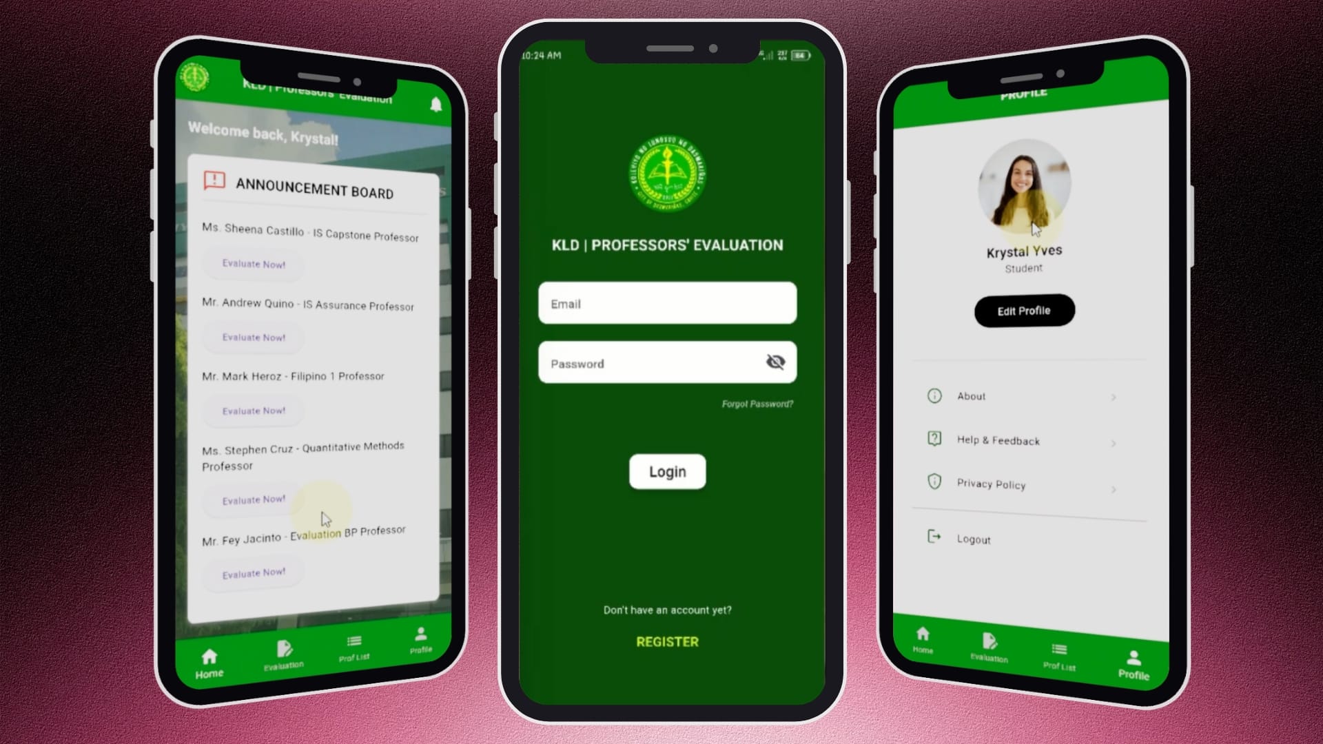
Quick Links Video Demo Problem Statement Objectives Key Features User Flow Technology Stack Categories Mobile DevelopmentTech Projects Tags Android StudioDartFaculty EvaluationFirebaseFlutterMobile DevelopmentSurvey System Project Title: Development of a Professors’ Evaluation Mobile Application Project Type: Academic Project – Mobile Application Role: Mobile App Developer Tools Used: Flutter, Dart, Firebase, Android Studio, Figma Overview The Professors’ Evaluation Mobile Application is an academic project designed to digitize the faculty evaluation process for higher education institutions. The application enables students to securely evaluate professors through a mobile platform while providing an organized workflow for managing pending and completed evaluations. By replacing traditional paper-based evaluation forms, the system improves accessibility, data accuracy, and efficiency. Problem Statement Traditional professor evaluations are often conducted using paper forms or fragmented digital processes, making them time-consuming to distribute, collect, and organize. These methods may result in delayed submissions, incomplete records, and increased administrative workload. Students also have limited visibility into pending evaluations, which can lead to missed submissions. This project addresses these challenges by providing a centralized mobile application where students can conveniently complete evaluations, monitor their progress, and securely manage their accounts. Objectives Develop a mobile application for professor evaluations. Simplify the evaluation process through an intuitive user interface. Allow students to track pending and completed evaluation tasks. Securely collect and store evaluation data in a centralized database. Improve efficiency and accuracy in managing faculty evaluations. Key Features User Authentication – Secure user registration and login – Email and password validation – Password visibility toggle – Forgot password functionality – Comprehensive input validation and error handling Dashboard – Personalized welcome message – Announcement board displaying pending evaluation tasks – Quick access to evaluation forms – Bottom navigation for seamless page transitions Evaluation Management – Separate tabs for pending and completed evaluations – Dynamic list of professors assigned for evaluation – Timestamp tracking for completed submissions – Direct navigation to evaluation forms Evaluation Form – Dynamic display of professor and subject information – Rating and remarks input fields – Secure submission and database storage of evaluation results Professor Directory – Organized list of professors – Display of professor details – Easy navigation from the evaluation workflow User Profile – Dynamic profile information and profile image – Edit profile functionality – About, Help & Feedback, and Privacy Policy pages – Secure logout feature Profile Management – Real-time editing of contact information – Protected email field to maintain account integrity – Password verification before saving profile updates User Flow User registers an account and logs in securely. The dashboard displays pending evaluation tasks. The user selects a professor to evaluate. The evaluation form displays the professor’s information. The user submits evaluation scores and remarks. The evaluation is stored in the database and marked as completed. Users can review completed evaluations and manage their profile information. Technology Stack Frontend Flutter Dart Backend Firebase Authentication Cloud Firestore Firebase Storage Development Tools Android Studio Figma Challenges Designing a smooth evaluation workflow while preventing duplicate submissions. Implementing dynamic task management for pending and completed evaluations. Managing user authentication, validation, and profile updates securely. Building an intuitive mobile interface that simplifies the evaluation process while maintaining data integrity. Results https://vimeo.com/1203675521?share=copy&fl=sv&fe=ci The application successfully digitized the professor evaluation process by providing students with an organized, accessible, and user-friendly platform for completing evaluations. It streamlined evaluation management, improved data consistency, and demonstrated how mobile applications can modernize academic administrative processes. Conclusion Developing this project strengthened my skills in Flutter development, Firebase Authentication, Cloud Firestore, mobile UI/UX design, form validation, state management, and database integration. It also provided valuable hands-on experience in building a complete mobile application, implementing secure authentication, managing dynamic data, and creating user-centered workflows that solve real-world academic challenges.
Room Availability Mobile App
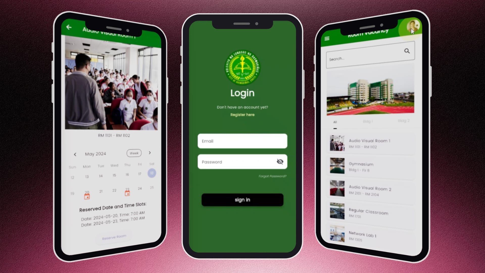
Quick Links Video Demo Problem Statement Objectives Key Features User Flow Technology Stack Categories Mobile DevelopmentTech Projects Tags Android StudioDartFirebaseFlutterMobile DevelopmentReservation SystemRoom AvailabilityRoom Booking Project Title: Development of a Room Availability Mobile Application Project Type: Academic Project – Mobile Application Role: Mobile Developer Tools Used: Flutter, Dart, Firebase, Android Studio, Figma Overview The Room Availability Mobile Application is an academic project developed to streamline classroom reservation and room availability management within the Kolehiyo ng Lungsod ng Dasmariñas (KLD). The application provides students with a centralized platform to browse available rooms, view reservation schedules, and submit booking requests, replacing the traditional manual reservation process with a more efficient digital solution. Problem Statement Managing classroom reservations manually often leads to scheduling conflicts, delayed approvals, and limited visibility of room availability. Students have difficulty determining whether a room is already reserved, while administrators spend significant time verifying schedules and handling booking requests. This project addresses these challenges by providing real-time room availability information, reservation validation, and an organized booking workflow. Objectives Develop a mobile application for room availability and reservation management. Prevent double-booking through automated reservation validation. Allow students to reserve rooms using their official KLD email accounts. Provide an intuitive and user-friendly interface for browsing rooms and managing reservations. Improve the overall efficiency of the reservation process. Key Features User Authentication – Secure login and registration – Validation for KLD email addresses – Password visibility toggle – Forgot password functionality – Input validation and error handling Room Browsing – Search rooms instantly – Categorized room listings – Building filters – Dynamic room information – Hero banner and responsive interface Room Availability – Calendar view with Month, Week, and Two-Week filters – Visual indicators for reserved schedules – Dynamic display of room details and existing reservations Reservation System – Reservation form with date, time, number of occupants, reservation purpose – Automatic conflict detection to prevent duplicate bookings – Reservation submission with database integration – Confirmation popup informing users that approval will be sent via email User Profile Management – Dynamic user profile – Edit personal information with real-time database updates – Navigation drawer with profile, Privacy Policy, Welcome message, KLD branding User Flow User registers using a valid KLD email. User logs into the application. User browses available rooms or searches for a specific room. User selects a room to view detailed availability. User checks the reservation calendar. User completes the reservation form. The system validates the selected date and time. If no conflict exists, the reservation is saved to the database. The user receives confirmation that the reservation is awaiting approval via email. Technology Stack Frontend Flutter Dart Backend Firebase Authentication Cloud Firestore Firebase Storage Development Tools Android Studio Figma Challenges Implementing real-time validation to prevent overlapping reservations. Synchronizing reservation data with the calendar interface. Designing a user-friendly navigation flow while maintaining data integrity. Handling authentication, form validation, and database updates efficiently. Results https://vimeo.com/1203671798?share=copy&fl=sv&fe=ci Conclusion The completed application successfully digitized the room reservation process by providing real-time room availability, automated booking validation, and an intuitive mobile experience. The system minimized scheduling conflicts and demonstrated how mobile technology can improve campus resource management. Developing this project strengthened my skills in Flutter mobile development, Firebase integration, authentication, database management, form validation, state management, and user interface design. It also gave me practical experience in designing a complete end-to-end application—from planning the user flow and implementing core functionalities to testing and debugging. This project enhanced my understanding of building scalable mobile applications while applying software engineering principles to solve real-world problems.
Restaurant Mobile App
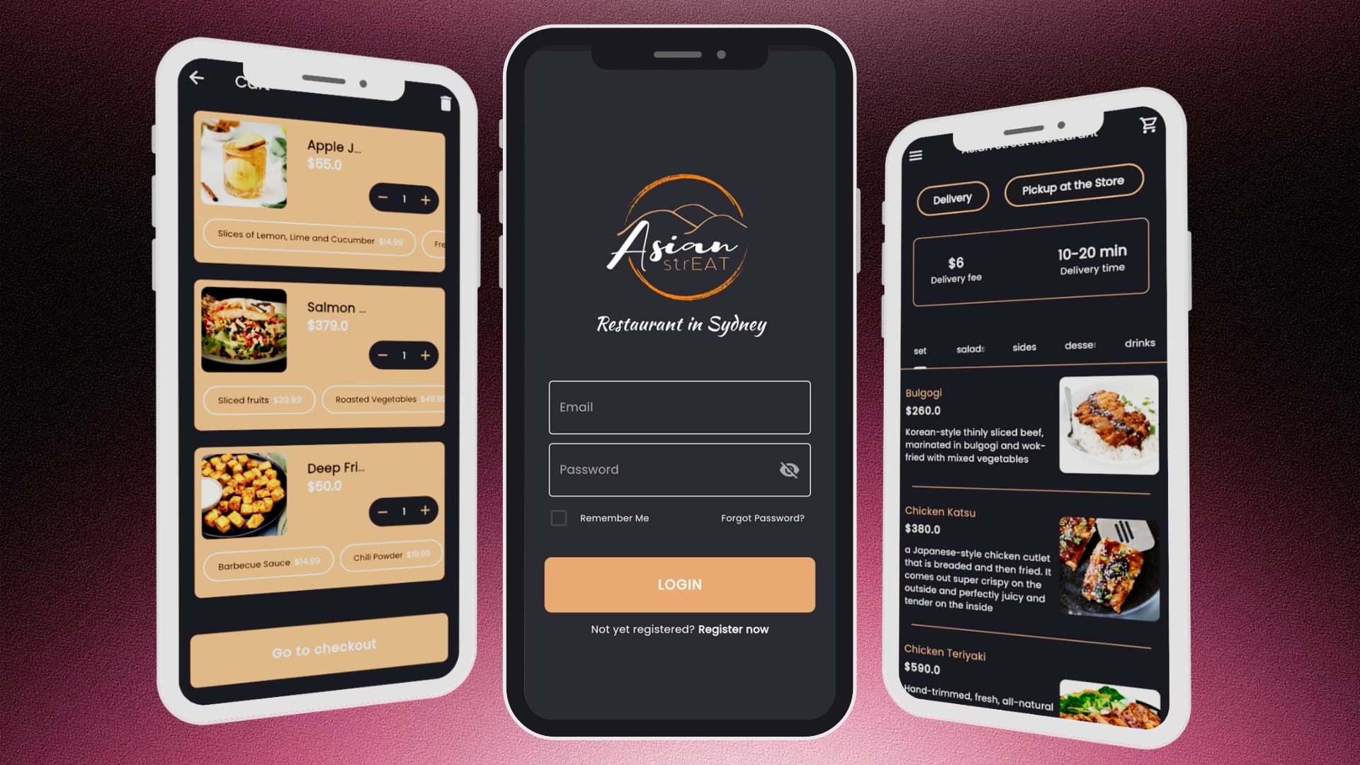
Quick Links Video Demo Problem Statement Project Objectives Key Features Development Methodology Technology Stack Categories Mobile DevelopmentTech Projects Tags Android StudioDartFirebaseFlutterFood OrderingMobile DevelopmentRestaurant AppUI/UX Design Project Title: Development of a Restaurant Mobile Application Project Type: Academic Project – Mobile Application Role: Project Manager • UI/UX Designer • Mobile Developer Tools Used: Flutter, Dart, Firebase, Android Studio, Figma Executive Summary The Restaurant Mobile Application is an academic mobile development project designed to address common challenges faced by restaurants in managing customer orders, improving service efficiency, and enhancing customer engagement. The application provides customers with a seamless digital ordering experience while enabling restaurants to streamline order processing and promote their products through an intuitive mobile platform. Developed using Flutter, the application delivers a modern cross-platform experience for Android and iOS devices. It incorporates essential restaurant features including digital menu browsing, food ordering, delivery and pickup options, secure user authentication, shopping cart management, payment processing, order receipts, loyalty membership, promotional offers, favorites, and customer support. The project demonstrates how mobile technologies can improve customer convenience while supporting digital transformation in the food service industry. Background The rapid adoption of mobile technology has significantly changed customer expectations within the restaurant industry. Modern consumers expect convenient digital services that allow them to browse menus, customize orders, complete secure transactions, and receive timely updates without relying on traditional ordering methods. Many restaurants, particularly small and medium-sized businesses, continue to depend on manual ordering processes or limited online platforms that may result in longer waiting times, order inaccuracies, and reduced customer engagement. These operational challenges highlight the need for an integrated mobile application capable of providing customers with a fast, reliable, and user-friendly dining experience. Problem Statement Traditional restaurant ordering processes present several operational challenges, including: Manual order taking that increases the risk of errors. Long waiting times during peak operating hours. Limited customer engagement outside the restaurant. Difficulty showcasing menu items and promotions. Lack of a centralized digital ordering platform. Inconvenient ordering and payment processes. Limited customer loyalty and retention strategies. These challenges affect both customer satisfaction and overall operational efficiency. Project Objectives The primary objective of the project was to develop a mobile application that enhances the restaurant ordering experience through digital technology. Specifically, the application aims to: Digitize restaurant ordering processes. Provide customers with an interactive digital menu. Support both delivery and pickup services. Simplify cart management and payment processing. Improve customer engagement through promotions and loyalty features. Provide secure account management and authentication. Deliver an intuitive and responsive mobile user experience. Proposed Solution The Restaurant Mobile Application provides a centralized platform where customers can conveniently browse menu categories, customize food selections, place orders, complete payments, and track their purchases from a mobile device. The system combines restaurant ordering, customer account management, promotional features, and digital payment functionality into a single application, improving both customer convenience and restaurant service efficiency. Key Features User Authentication User Registration Secure Login Remember Me Password Recovery Profile Management Digital Menu Customers can browse categorized menu items including meal sets, salads, side dishes, desserts, and beverages.Each product includes images, descriptions, pricing, and available add-ons. Food Ordering The application enables customers to: View product details Customize orders with add-ons Add items to cart Update quantities Remove products Proceed to checkout Delivery and Pickup Customers can choose between delivery and store pickup. The application allows users to schedule preferred dates and times while entering the required delivery or pickup information. Payment Processing The application includes a payment interface where customers can securely enter payment details before confirming purchases. Shopping Cart The shopping cart provides: Real-time item count Quantity management Cart summary Checkout functionality Cart clearing option Digital Receipt Upon successful payment, customers receive an electronic receipt containing: Ordered products Quantity Pricing Order summary Loyalty Program The application includes a membership feature that provides customers with information regarding premium membership benefits and future reward opportunities. Promotions and Vouchers Customers can browse promotional offers, discount vouchers, and limited-time deals. Favorites Users can save preferred menu items for faster ordering during future visits. Help and Information Additional customer support includes: Help Center Frequently Asked Questions Terms and Conditions Privacy Policy Video Demo https://vimeo.com/1206460564?share=copy&fl=sv&fe=ci Style Guide Development Methodology The project adopted the Software Development Life Cycle (SDLC) integrated with the Agile methodology to support structured and iterative development. This iterative approach enabled continuous improvements based on user feedback while ensuring the application met functional and usability requirements. Technology Stack Frontend Flutter Dart Backend Firebase Authentication Cloud Firestore Firebase Storage Development Tools Android Studio Figma Expected Outcomes The Restaurant Mobile Application is expected to: Improve customer convenience. Reduce ordering errors. Shorten ordering time. Enhance customer engagement. Increase accessibility to restaurant services. Support customer retention through loyalty features. Provide a modern digital dining experience. Conclusion The Restaurant Mobile Application successfully demonstrates the application of modern mobile development technologies in addressing common challenges within the food service industry. By integrating digital ordering, secure authentication, delivery and pickup services, payment processing, loyalty features, and customer engagement tools into a single platform, the project provides a comprehensive solution for enhancing both customer experience and restaurant operations. Throughout the project, valuable practical experience was gained in mobile application development using Flutter, cloud-based backend integration with Firebase, UI/UX design, system architecture, and Agile software development. The project also strengthened technical skills in cross-platform development, database integration, authentication, state management, and software testing, while enhancing problem-solving, collaboration, and project management abilities. Overall, the project bridged academic learning with real-world software development practices, providing industry-relevant experience and demonstrating the ability to design and develop scalable, user-centered mobile applications for the restaurant industry.